iRacing announced that as of this month (expected in March 2023 for the Season 2 build) that the old website version of iRacing’s UI will be sunsetted leaving us only the application UI to work with.
This is of course no problem whatsoever for (what I think) is the vast number of users on the platform. However, if you’re an iRacing OG (or you’ve been lazy/fearful of change like I have been!) then it’s time to embrace iRacing’s UI. Like all changes, it takes a little learning, but what doesn’t?
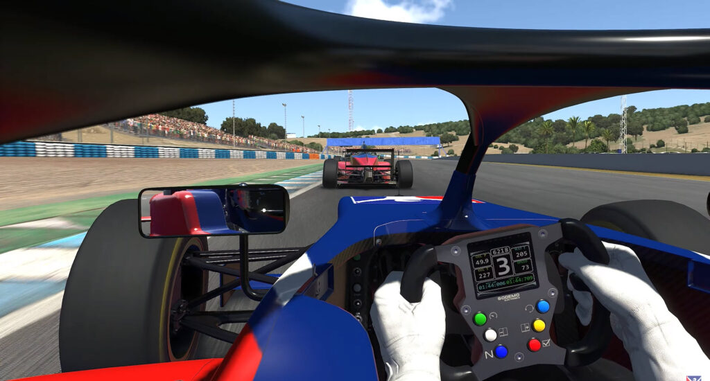
Having spent the required amount of time to come to terms with the change I feel like now couldn’t be a better time to have another look. When the UI was in beta frankly, it was pretty bad. I think that probably put a lot of iRacers off using it altogether. But a “steep learning curve” the new iRacing UI is not!
Naturally, it takes a moment to orientate yourself, but it’s obvious that iRacing has been working hard on this latest version. It looks amazing, especially in dark mode.
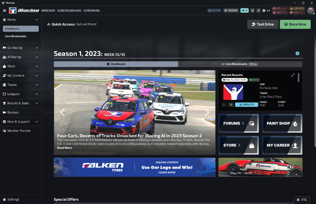
Evidently, iRacing has been investing in its new UI (user interface) for some years now. At first glance, in fact, it very quickly becomes obvious where things are and I’ve been unable to find any piece of functionality that hasn’t replaced the web UI.
The goal to improve upon the interface and general usability over and beyond what the website has been doing for a long time has been achieved and I’m now a convert. I feel a bit like I might be the last iRacer to do this but I suppose we’ll find out when the latest patch is released a little after this article is published.
Lest we forget, no one signs up for a racing simulator because of the UI but some might give up if they’re put off by a bad experience.
What’s the problem with the old iRacing website?
The website has had its day. Technically, it must have been a nightmare as there are very clearly several different technologies running on the domain including an old version of WordPress.
Comparing the website to the equivalent actions in the new UI, I agree it’s time to put the old iRacing website in the bin! So, on to making your iRacing UI transition.
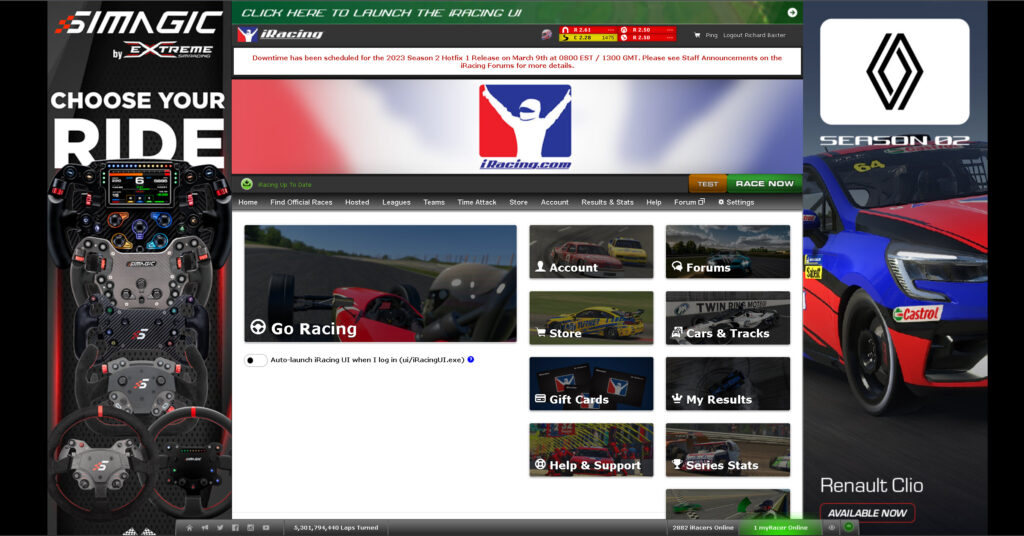
I think this might be the last ever screenshot of the old iRacing UI:
What do I do on a regular basis on the website? · Where to look · Left-hand sidebar · Top Right / Quick Access Section · It’s time to say goodbye to the iRacing web UI
What do I do on a regular basis on the website?
Like every other sim racer, there’s a handful of actions to perform on a regular basis:
- Browse racing categories
- Test
- Enter races
- Manage my account
- Set up and host races
- Buy cars and tracks
As far as iRacing’s setup is concerned, I was already using the application UI for things like running the graphics config (something I had to re-run a lot while testing different GPUs to get my graphics settings right.
Visit Our Sponsors
Where to look
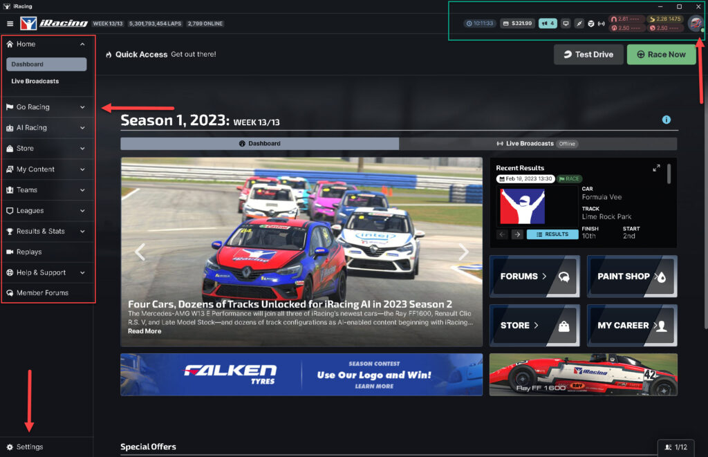
When you open the iRacing UI (installation puts a shortcut to this on your desktop) you’re confronted by the dashboard. The dashboard has a few key areas to concentrate on:
Left-hand sidebar
Highlighted top left: The default option on the sidebar menu is Home, followed by “Go Racing” and “AI Racing”. You can also watch live broadcasts with the option immediately below.
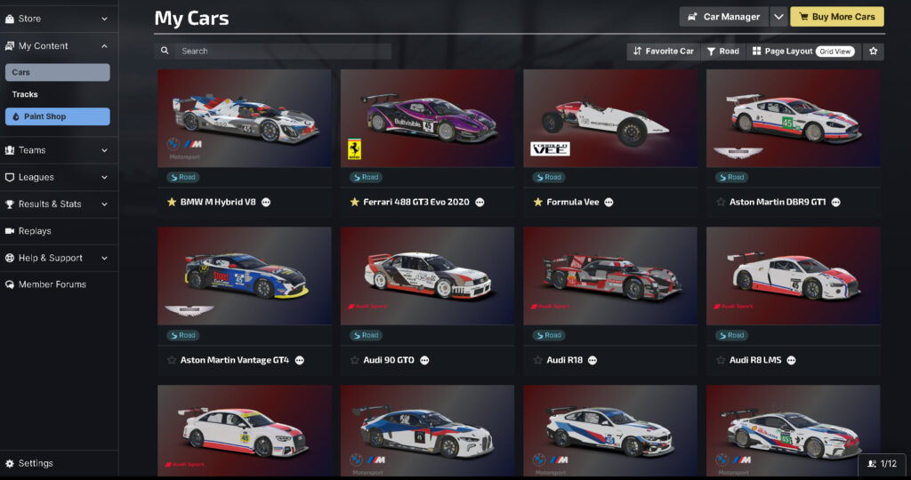
Subsequently, the menu also displays a link to the content store, where you can either buy new content or view the content you own under “My Content”. Additionally, the sidebar provides options to set up teams, view and participate in leagues, access result data, replay past races, seek assistance through the Help & Support function, and participate in Member Forums.
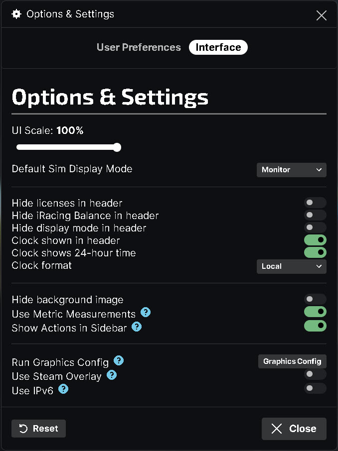
There’s also a new settings option at the very bottom of the left-hand sidebar. This is where (amongst other things) you’ll find the graphics configuration:
Most drivers consider the left-hand sidebar the “real UI” of the iRacing GUI. The main (center) window view in dashboard mode is news and updates but rarely anything consequential to the goal of going racing.
The menu bar is well-categorized and intuitive. Want to race? Click “Go Racing” and you are presented with 6 very clear options.
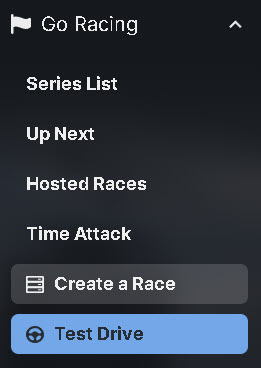
Whether you click “Series List” or “Up Next” you’re presented with essentially the same view:
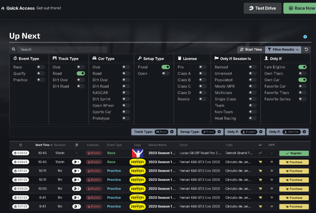
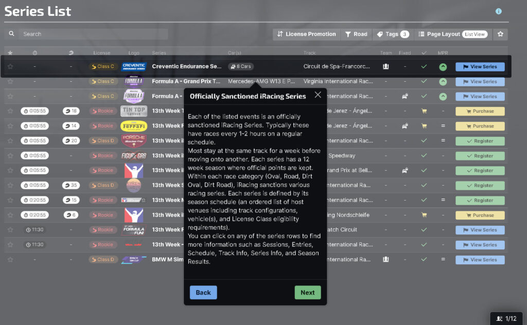
As you can see, using the filter results button on the top right means you can drill down to racing that is relevant to your interests. This is by far a better approach to finding races in iRacing. For example: “show me races that my favorite car is eligible for”. All of this is extremely self-explanatory although there are a handly set of prompts that appear if you’re in this view for the first time:
If you want to join a hosted race or create one of your own, again that has been massively improved:

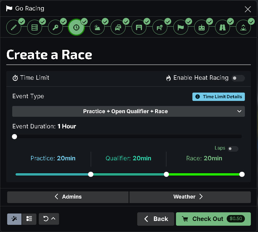
Creating a race is extremely self-explanatory, as is joining a hosted session:
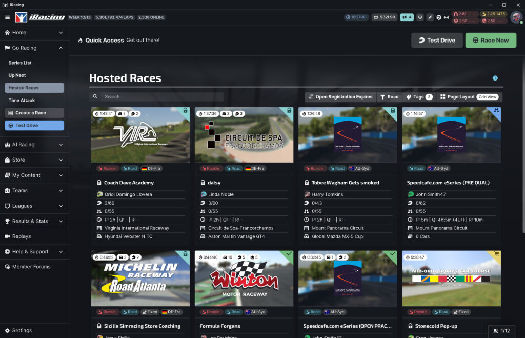
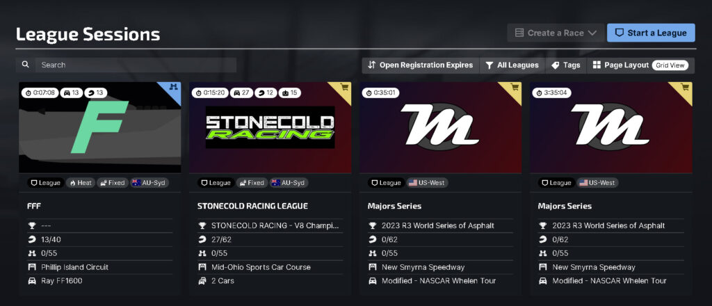
As you can probably see by now, the options are presented in a really intuitive way. Want to join a league or create your own? Open the “Leagues” option in the left hand sidebar:
Top Right / Quick Access Section
I think this might be a more recent addition, the familiar big green “Race Now” button is reassuring somehow. But it just takes you to the same race listings view that “Go Racing” presents.

Along the quick access header, you have the current time (not iRacing time!), which will match whatever your time setting is on your PC. It also shows your iRacing credit balance, important notifications, the number of iRacers currently online, your connection status, your license (mine is in a terrible state at the moment), and your helmet, which is actually a set of options that you should definitely take a look at.
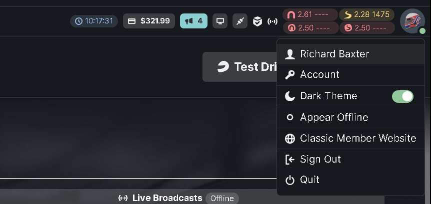
I’d imagine the “Classic member website” link will disappear at some point. The only other major change here is, as I mentioned earlier, “Settings” has moved from this navigation menu to the left-hand bottom section of the dashboard.
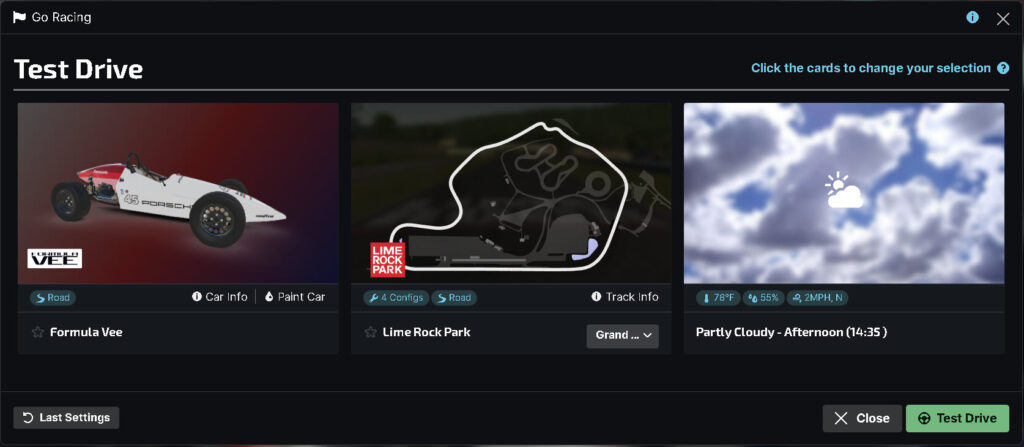
Naturally, you might want to test instead of racing. The test drive dialogue gives you all of the options you’d expect:
Finally a view of the dialogue if you plan to create a race – again, very much refined and very clear on how to progress through the various stages to pick a car, track, weather conditions and so on:
It’s time to say goodbye to the iRacing web UI
The iRacing UI is highly functional and easy to use. A good comparison would be the rFactor2 UI, and in that comparison, iRacing wins hands down (sorry rFactor2 – love you guys!!).
The transition is strange initially, but within 30 minutes or so you come to terms with their design decisions, and the penny drops. It’s efficient and does not stand in your way to go racing, organize your teams, test, manage your content and so much more. In summary, the iRacing application UI is here, it’s easy to use because it’s simple and powerful.
Related articles
Topic: iRacing
